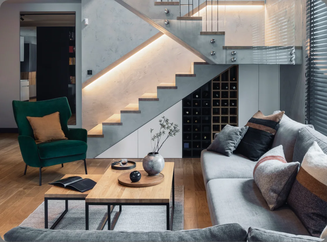
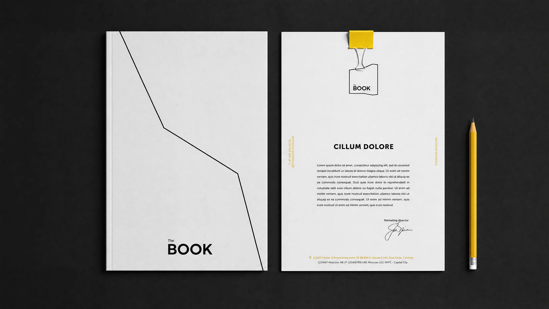
The Book is a multifunctional residential development housed in one of Moscow’s most recognisable modernist landmarks, located in the heart of the city. Built in 1968 as part of the ambitious redevelopment of Kalinin Avenue, the 26-storey building, widely known as “the Book” for its distinctive silhouette, was conceived as a new model of urban living. Following a major reconstruction, it now brings together private residences, serviced apartments, an international hotel and hospitality spaces under one roof.
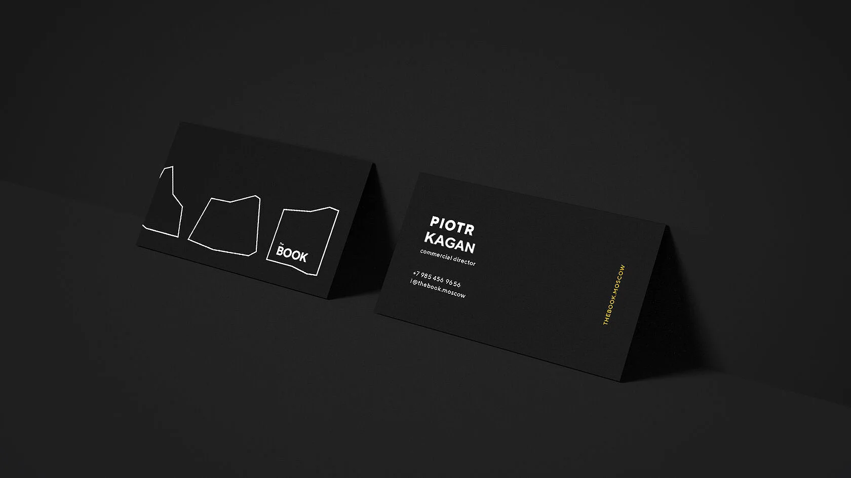
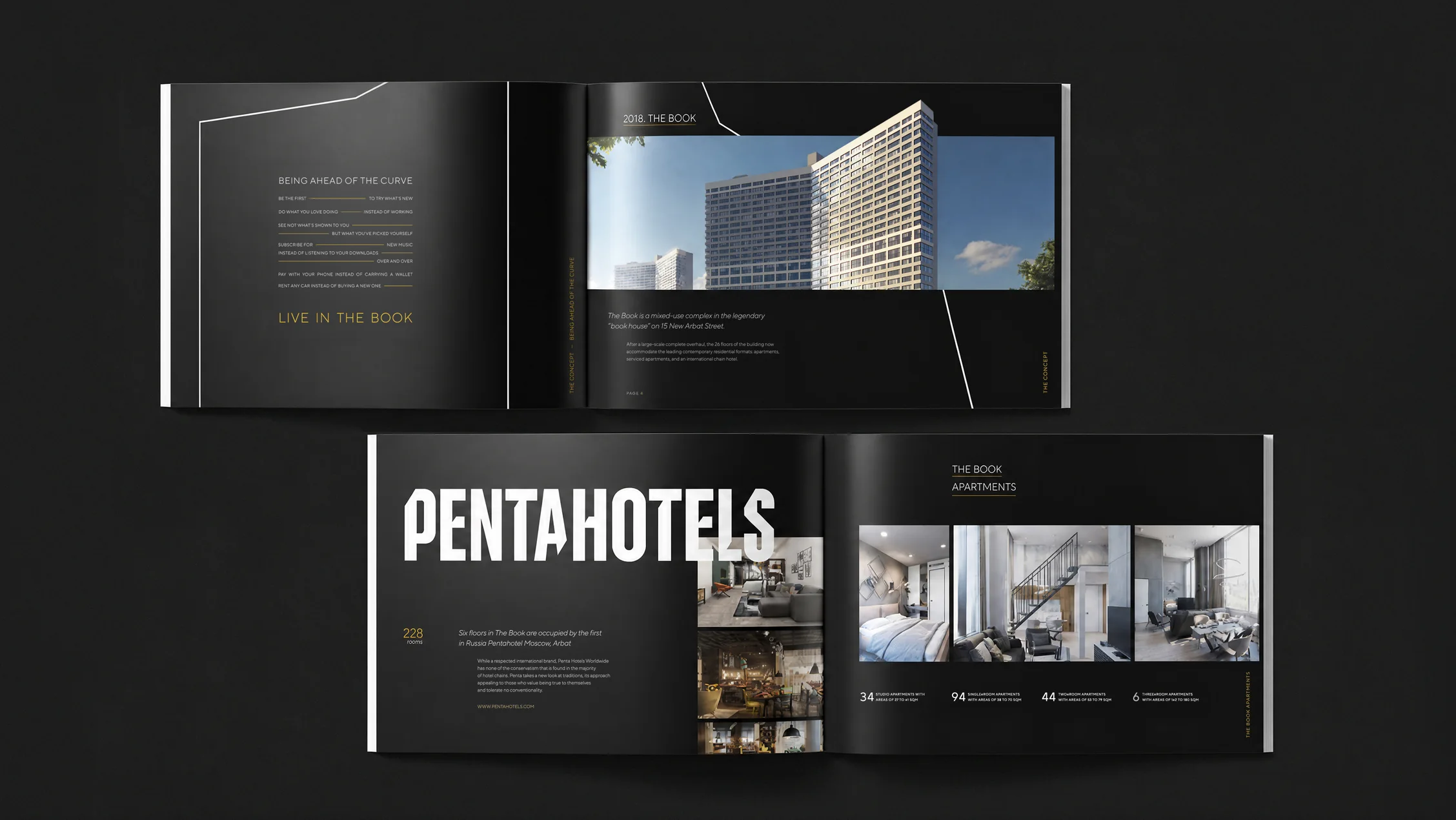
The building’s book-like silhouette has been part of Moscow’s skyline for decades, making its architecture the natural starting point for the brand. That’s why the identity is built around this iconic form, turning the historic silhouette into the project’s key visual signature and reinterpreting it through a contemporary graphic language.